Designing ADA compliant room ID signs for your office might seem straightforward, but there are some pitfalls that can trip you up. Getting these signs right is crucial, not just for compliance, but also for making your workplace accessible and welcoming to everyone. Here are some of the most common mistakes that people make when designing room ID signs and how to avoid them:
Ignoring Font Size and Legibility
Choosing fonts that are too small or overly decorative is one of the biggest and most common mistakes. ADA guidelines are very specific about font size and readability because the signs need to be easily read by people with visual impairments. Fancy scripts might look stylish, but they can be nearly impossible to read quickly.
To that end, when designing signs, stick to clear, sans serif fonts like Helvetica or Arial, and make sure that the text contrasts sharply with the background. This simple step can prevent confusion and frustration for your employees and visitors.
Forgetting About Braille Placement
Many people focus on the visual aspects of the sign and forget about braille. ADA compliant signs require tactile braille that matches the room name or number.
Placement is just as important as the braille itself. The signs should be mounted at a height that allows wheelchair users and standing individuals alike to access them comfortably. Misplaced braille can render the signs practically useless, so double-check the guidelines before installing any.
Overlooking Color Contrast
Color contrast is often underestimated. A sign might look pretty, but if the text doesn’t stand out from the background, it fails the ADA standard. People with low vision or color blindness rely heavily on contrast to distinguish letters and numbers.
Make sure there’s a strong difference between text and background colors. Dark text on a light background usually works best, but always test your choices in real lighting conditions to ensure readability.
Skipping Durability and Material Considerations
Signs are subjected to a lot of wear and tear, especially if they’re located in high-traffic areas. Using cheap or fragile materials can make your sign fade, scratch, or peel over time, which compromises accessibility.
It’s worth investing in materials that hold up, like engraved plastics or metals. Durable signs not only comply with ADA standards longer but also save you from costly replacements down the line.
Forgetting the Placement of Room Numbers
Finally, placement of the room ID itself is crucial. Signs should be positioned consistently throughout the office so visitors know where to expect them. Placing signs too high, too low, or in inconsistent locations can confuse people and make navigation difficult.
Following a uniform placement strategy enhances usability and keeps your office feeling organized and professional.
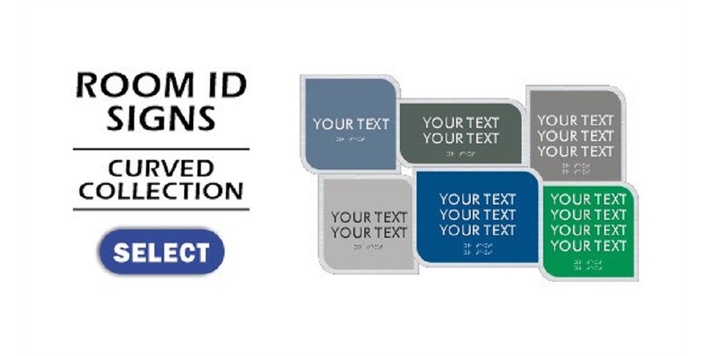
Make Accessibility a Priority with Braille Sign Pros’ Room ID Signs
Avoiding these mistakes ensures your office remains inclusive and navigable for everyone. With ADA compliant signs, you don’t just follow the law; you demonstrate that you respect the needs of your employees and visitors. Paying attention to the font, braille, color contrast, material, and placement creates an environment that’s both functional and welcoming.
Braille Sign Pros offers an extensive selection of ADA compliant room ID signs in various colors and designs. They make it easy to outfit your entire facility with uniform signage. Simply select a suitable design from the list of options available on their website and customize them with the text that you need. They also accept custom orders: just send an email to sales@braillesignpros.com or call 888-297-8577.